
12/03/2012


27/02/2012
Creating a Music Magazine, Part Four.
After the completion of the contents page my next task was to create a double page spead. I asked Lucy to sit down and create a mock up interveiw with me, here is a snippet of how it went:
"Uke magazine first met Lucy Hurst 3 years agowhen she was just starting out.
Now she has three singles and a brand new debut album due out in a few weeks.
We caught up with her to talk about the new album and where she plans to take it from here."
"Casually sitting on the beach looking out to the vivid blue waves, Lucy sits holding her prized Ukulele joined by Uke's very own Kevin Heinz"
"Uke: So Lucy how are you?
Lucy: I am doing alright, got a lot going on with the new album"
The Framework:
I created my basic double page spread framework in GIMP 2.0 the free downloadable art program.
First I created an A4 sheet, then I increased the size of the canvas to A3 and copied the A4 so that I would have a clear page divide.
I created my basic double page spread framework in GIMP 2.0 the free downloadable art program.
First I created an A4 sheet, then I increased the size of the canvas to A3 and copied the A4 so that I would have a clear page divide.


Choosing a Photo:
The next important task was to pick the correct photograph for one side of the double page spead.
I really love the relaxed posture of Lucy in this one and the lighting is perfect, the added reverse direction of the dog is an extra artistic feature which works really well.
The next important task was to pick the correct photograph for one side of the double page spead.
I really love the relaxed posture of Lucy in this one and the lighting is perfect, the added reverse direction of the dog is an extra artistic feature which works really well.

The Background:
Again I wanted to keep the re-occuring theme of pink with the double page spread. Instead of such a heavy pink I went for a softer and darker variation. This darker variation gave a whole different feel to the interveiw it made it warmer and gave it a more personal feel.
I wanted to use an older look so I combined the pink with a sepia tone and a crumpled paper look, the brushes I used for these effects came from www.deviantart.com

 PAPER: http://browse.deviantart.com/?qh=§ion=&global=1&q=paper+gimp+brush#/d38c83r
TORN: http://browse.deviantart.com/?qh=§ion=&global=1&q=paper+gimp+brush#/djduq1
Again I wanted to keep the re-occuring theme of pink with the double page spread. Instead of such a heavy pink I went for a softer and darker variation. This darker variation gave a whole different feel to the interveiw it made it warmer and gave it a more personal feel.
I wanted to use an older look so I combined the pink with a sepia tone and a crumpled paper look, the brushes I used for these effects came from www.deviantart.com


TORN: http://browse.deviantart.com/?qh=§ion=&global=1&q=paper+gimp+brush#/djduq1
The Name:
Having Lucy's name on her double page spread is important as it catches the attention of the reader.
I wanted to use the same font on the double page spread as the title, I got the font from www.dafont.com its name is 'Jellyka - Nathaniel a Mystery.'
I wanted to use the same font on the double page spread as the title, I got the font from www.dafont.com its name is 'Jellyka - Nathaniel a Mystery.'

The Album:
As an added extra I created a mock album cover and here I chose to advertise it along with the interveiw.
As an added extra I created a mock album cover and here I chose to advertise it along with the interveiw.

Finished Framwork:

I am really pleased on how the finished framework looks all I have to do now is add my interveiw with Lucy in and it will be completed.
06/02/2012
Creating a Music Magazine, Part Three.
Next thing to create was the contents page. I kept the colour theme running throughout the contents as well as the magazine front cover. This is due to the special edition release of the 'pink edition'. Using 'Adobe Illustrator' I laid out the basic frame work for the text.
The Framework:


Creating a Music Magazine, Part Two.
I wasn't very happy with my first magazine front cover so I decided to re-open the file and tweak several features and make general improvements.
 |
| First magazine cover. |
I felt that the fur ruff of her hood wasn't neatly defined, I revisited the hood and used a smudge tool to create more of a natural flow of the fur. I had her name advertised in the badge but it felt too small, her name was being over shadowed by the names in the coverlines which didn't work. I changed the coverlines so that they were smaller and then shifted the badge up slightly and put her name across her image, using a multiply effect so that it overlaps but doesn't completely cover her coat. Once I had changed font sizes and shifted several features round I added more vines and lowered the shade of pink.
The Completed Cover: (with edits)

CD Cover:
As an extra in preparation of the double page spread I have created a mock CD album cover to feature in the article with her. I looked over my photographs and picked one which doesn't reveal too much of her, this is due to if she was a famous celebrity her name would be enough to sell her products.
The Chosen Photo:

I cropped the image down and then began editing the image, I grabbed an image of the night time stars and laid it over the sky, changing the effect so that they were very subtle, yet added that mysterious feel to the front cover. I asked Lucy what she would call her CD and she replied with 'That's a difficult question' so it stuck, I literately used that as the name of her CD cover.
The Finished Cover:

Creating a Music Magazine, Part One.
My task requires me to create a magazine for a music magazine, I had to begin with ideas for naming and layout. In this blog entry I will discuss my steps for creating the front cover.
The Layout:
To get the desired layout size I used the program 'GIMP 2.0' on my laptop at home. It gives you the exact page size of an A4 sheet of paper.

The Name:
I wanted the name to be easy to say and one that would fit the Ukulele theme. A Ukulele is often shortened to Uke so I have used this as the name.
Photographing:
Using my digital camera my friend, Lucy who is featured as the model in my magazine and I went to a beach scene and took several photographs to be used on the front cover, contents and double page spread. Here are the key photos:


The Creation of the Cover
Once I had my A4 canvas laid out I had to pick one of my images and paste it in. I chose this one:
Out of all the images I took this is the best one to get a three quarter shot out of, I cropped it down near her waste and then erased all of the background. The image looked professional as it echoed the magazine Q which I was studying for magazine conventions. One of Q's conventions was the iconic red box which features the Q masthead. I wanted to use the same iconic box but replace it with my title of Uke.
 |
| Adding the box behind model. |
Once I added the box I needed to create my title within this space and work out a colour scheme that would suit the clothing the model is wearing and would also be suitable for the theme of a special pink edition.
 |
| Adding a badge and working out colour. |
I considered grey at one point as it matched her clothing, however it wouldn't fit the conventions of a female orientated magazine. After I had settled on a eye catching pink shade I added a badge to the front of the cover advertising the '6 Page Exclusive' part of which I would feature later on in the magazine as part of the double page spread. After I had completed the basic layout and badge design I worked with my tagline and coverlines. Underneath the masthead I added 'The Finest Ukulele Magazine in the UK' and put on several coverlines mentioning other Ukulele artists and a chance to win a trip to Hawaii. Along with the basic information I wanted to add extra eye catching flair to the front of the magazine. This is where the vine tool in GIMP came in handy. I changed it to the colour of the masthead background and added several vines across the page. I carried the vines through to the design of the masthead background as well. With the vines I wanted a little something extra on the masthead so I went on google images and found a clipart of a Uke which was free to use.
Here is the original clipart:
| http://www.clker.com/cliparts/T/H/R/g/B/i/ukulele.svg |
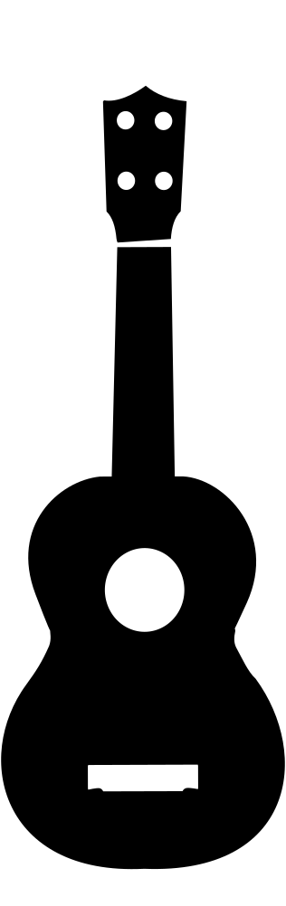
Even after I had finished with the vines something was missing, I had mentioned all of the information yet I hadn't informed the reader much about the actual edition of the magazine itself. I added a pink banner across the bottom of the magazine and added the information of the special edition release.
The First Final
Subscribe to:
Posts (Atom)