Showing posts with label EMPIRE. Show all posts

03/10/2011

Magazines & Audiences, Magazine Analysis, Task Two.

Empire Magazine - 2010 - TRON


Empire is a british film magazine, which is published monthly by Bauer Consumer Media. The first issue was released in July 1989 and is still being produced today. It is the biggest selling film magazine in Britain, outselling its market rival Total Film. Empire's audience is the generic film fan, the edition I have picked to analyse is one of the TRON edition covers. This cover features the main protagonist Sam Flynn the son of Kevin Flynn the main protagonist in the original TRON movie.

There are several clear indicators as to why movie goers are the target of this edition of the magazine. This particular issue also appeals to fans of the TRON franchise and comic con attendants. Here is my breakdown of the magazine.

Two different versions of the Empire Masthead, one they did for the TRON edition the other is their standard.
Starting with the masthead, I included the original which is a generic magazine big bold font type. The TRON edition changes two things with the masthead.

1 - The font type is still big and bold yet it isn't in the standard red colour its been changed to fit the TRON franchise. Within TRON franchise they have a neon coloured font type, this reflects the theme of the movie. Having EMPIRE echo this font type and neon glow it will be familiar to the fans of TRON. The masthead isn't effected in its power to draw in the audience of the EMPIRE readers, it makes it a collectable a piece of special edition merchandise for both regular readers of EMPIRE and the TRON fans.

The TRON type face.
2 - Sam Flynn the actors image overlaps the EMPIRE masthead. I have noticed that this effectively does two things to the magazine. It draws in more attention to the actor and the TRON franchise as people will want to collect it for his image. EMPIRE magazine, being around for a long time and being as strong as it is, have the confidence to cover their masthead slightly and know that their readers can still recognise who they are and will still purchase their magazine and not another competitors.
I have noticed that EMPIRE magazine have used this several times.


The TRON edition I have chosen has a very minimalistic feel to it, their more usual covers have far more coverlines and several contain a few smaller images. When looking at the Blockbuster issue you can see the difference in contents on the front. The audience is more direct and key on the TRON edition wheras the Blockbuster issue is marketing to a much wider film going audience.


Having very few coverlines highlights how they are trying to draw in their target reading audience. They want them to focus on the very key elements of Comic-Con, Superheroes and TRON Legacy. The three key points are all linked as the cast of TRON Legacy attended Comic-Con to promote the film and franchise.  The listed 'Plus' giving incite into the rest of the magazine is all Superhero related.


The exclusivity of the TRON movie and EMPIRE is a huge point of interest to the intended buyer of the magazine. The whole cover shouts exclusive and important, it displays character shots, the name of the film and the fact that EMPIRE has a World Exclusive about the TRON film. To film goers and Comic-Con fans alike a sneak preview of the next biggest film or part of a well loved franchise is huge. This desirableness is key in selling and marketing a magazine.


When purchasing a magazine it is important to be able to trust the information you are getting. Online people are more willing to believe that the information could be false, a rumour. When you are producing a magazine you are given the trust in to determining what is true and what is rumour. EMPIRE are proud of their achievements as a magazine and often show this by using badges and the selling line. I have featured below the badge used on the front of this issue of the magazine. Having displaying the information of 'MAGAZINE OF THE YEAR 2010' means it is a magazine with a great reputation and has a strong reading audience. This gives new readers more reason to grab this issue.


Even though this issue is clearly based around TRON, EMPIRE still need to bring back their previous buyers. Alongside the clear Comic-Con and Superhero linked theme, they include several names of directors and producers which as they are well known names within the film world it will encourage fans of those names to also buy the magazine. Under the names of Spielberg, Cameron and Zemeckis it shows how they will in their article discuss the future of movies. New technology and film is very important for movie watchers and is always in the spotlight, to feature such a controversial topic of 'revealing the future' of movies is another hook for the magazine to entice readers into buying. 


EMPIRE magazine have used the layout and the content to draw in the readers, using the TRON release as a huge boost to their target audience and linking TRON with similar themes such as Superheroes draws in readers even more. The use of subtle and few coverlines gives the feel of mystery and exclusivity, especially when it comes to the future of movies and the main world exclusive on TRON Legacy.

Magazines & Audiences, Magazine Terminology, Task Two.

As I will be eventually creating my own magazine front cover it is best to gather as much information I can on how to create an eye-catching, bold and 'snazzy' cover of my own. I have already started brainstorming ideas of what could go where and what main headlines I can include. I cannot however jump straight into creating one without some sort of layout to follow, otherwise the results could be a complete eyesore!

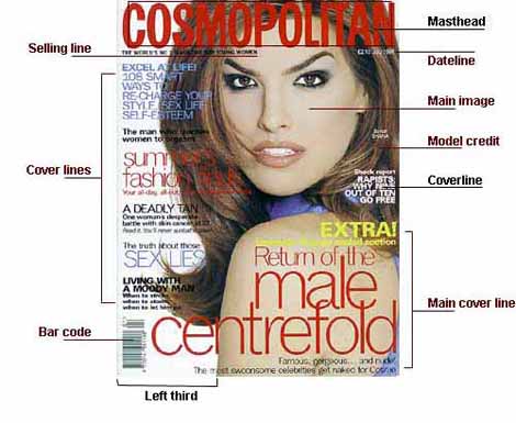
I have constructed myself a listed glossary of key terms and information to check off for when I come to creating my own.

MASTHEAD - The Masthead of the magazine is the most important part, your readers need to see exactly what magazine they are buying. When coming to design a Masthead it should be clear to read and the colour scheme should be carefully chosen. It is no good someone coming into a shop and looking to buy a 'Cosmopolitan' and walking out with some strange mens magazine, not sure if they would be too happy! Basically the Masthead is the visual branding of the magazine.

- Empire Magazine, note how bold the Masthead is!
DATELINE - Dateline is always important, one example is how collectors need to know what issue to talk about. How many times have you heard "Oh did you see what happened in issue 89? The one where Batman did this?" If you haven't heard this very much you might not know me personally but its a great example... Anyway the Dateline is the month, year and date of the publication. With the majority of most magazines they release their issue a whole month before, so they will release the January issue in December. It is also usually located above the barcode or in its own special area.

On this example the Dateline is near the Masthead.
MAIN IMAGE - On the majority of magazine covers you will find they have one huge central image which can either have one or two mini images surrounding. The central image is key to a magazine as it draws the target audience in. You certainly wouldn't have a photograph of a lion on the front cover of a women's magazine it would just create confusion and probably wouldn't sell very well. The models focus is usually looking straight forward out into the target audience, using direct eye contact to grab their attention.

The Main image features Selena Gomez
MODEL CREDIT - It is very unusual for the model to be given credit on the front of a magazine, this information is usually listed in the Contents section of the magazine.

COVERLINES - Coverlines are distributed around the main image, they are written in a smaller font than the Masthead and usually in a different style. The job of a Coverline is to give you snippets of information contained within the magazine. 

A coverline from Empire magazine advertising Thor
MAIN COVERLINE - The main coverline is the largest text on the front of the magazine next to the Masthead. It is designed to be eye catching and attention grabbing. It will usually take up about a quarter of the magazine cover. The basic layout for the Main Coverline is for it to be written in three layers, each a different colour. These colours will also usually reflect the Dateline, for example the October issue will be shades of oranges and browns.

Coverline featuring Inception from Empire Magazine

LEFT THIRD - In Western countries the left third is a vital selling tool for selling magazines in shops. Where most of the time, due to the way the shelving is arranged, the title must be clear and easy to read and easily distinguishable when put next to another magazine that may have a similar theme or colour scheme.
In this pile of magazines can you spot similarities which could confuse?
                        BARCODE - The barcode is a standard barcode used by most retailers. 

SELLING LINE - The short sharp description of the title's main marketing point. As an example it could be 'The World's No:1 Magazine for Men!" or it could set out its editorial philosophy.

THE WORLD'S BIGGEST MOVIE MAGAZINE - Empire Magazine

BUMPER ISSUE - Another technique to encourage people to buy, it bigs up the amount of pages and stories the issue is containing. Perhaps its a one off thing that they do? They may release only a 74 page magazine but for a special holiday like Christmas they will have a 102 page special.

Empire Magazines Harry Potter Bumper Issue

FREE PULL-OUT - A free pull-out is several or a double page spread which usually has a poster printed across them.

A series of fold-out posters given away as free pull-outs
BADGE - A small circular badge object on the front of the magazine, often displaying extra attention grabbing information.

This badge advertises  - THE MOVIE EVENT OF 2010
FONT - A set of type characters, numbers and punctuation marks, in one face and size. 

BASE LINE - An imaginary line where a line of text would sit upon.
I added the red lines from a clipping of Empire Magazine to demonstrate a Base Line
BI-WEEKLY - A magazine published every two weeks or twice a month.

WHITE SPACE - The use of space around headlines or images for design purpose.
The white space draws the attention to the actors and type on the front of the magazine.